Openbravo Issue Tracking System - Retail Modules |
| View Issue Details |
|
| ID | Project | Category | View Status | Date Submitted | Last Update |
| 0026736 | Retail Modules | Web POS | public | 2014-05-29 23:39 | 2017-03-28 18:11 |
|
| Reporter | dbaz | |
| Assigned To | rqueralta | |
| Priority | normal | Severity | minor | Reproducibility | always |
| Status | scheduled | Resolution | open | |
| Platform | | OS | 5 | OS Version | |
| Product Version | | |
| Target Version | | Fixed in Version | | |
| Merge Request Status | |
| Review Assigned To | |
| OBNetwork customer | No |
| Support ticket | |
| Regression level | |
| Regression date | |
| Regression introduced in release | |
| Regression introduced by commit | |
| Triggers an Emergency Pack | No |
|
| Summary | 0026736: [UX] Misalignment between several WebPOS boxes |
| Description | There is a misalignment between several WebPOS boxes
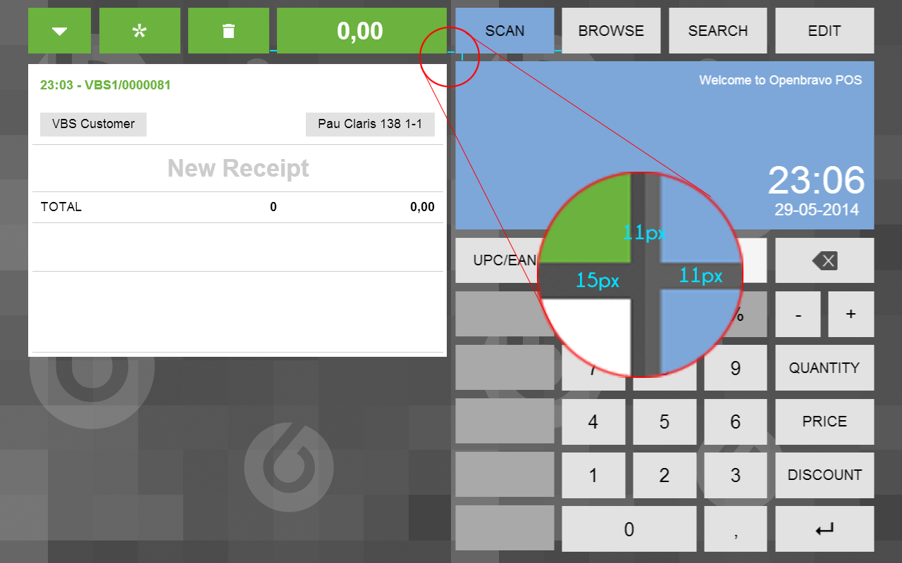
Case 1: The "ticket" box should be 4 pixels upper (the same with the "index card" view). You can see the attached [issueBoxAlignment-1.png] image and notice that the distance between this ticket box and the top tabs is not the same than the distance between the right side box and the tabs.
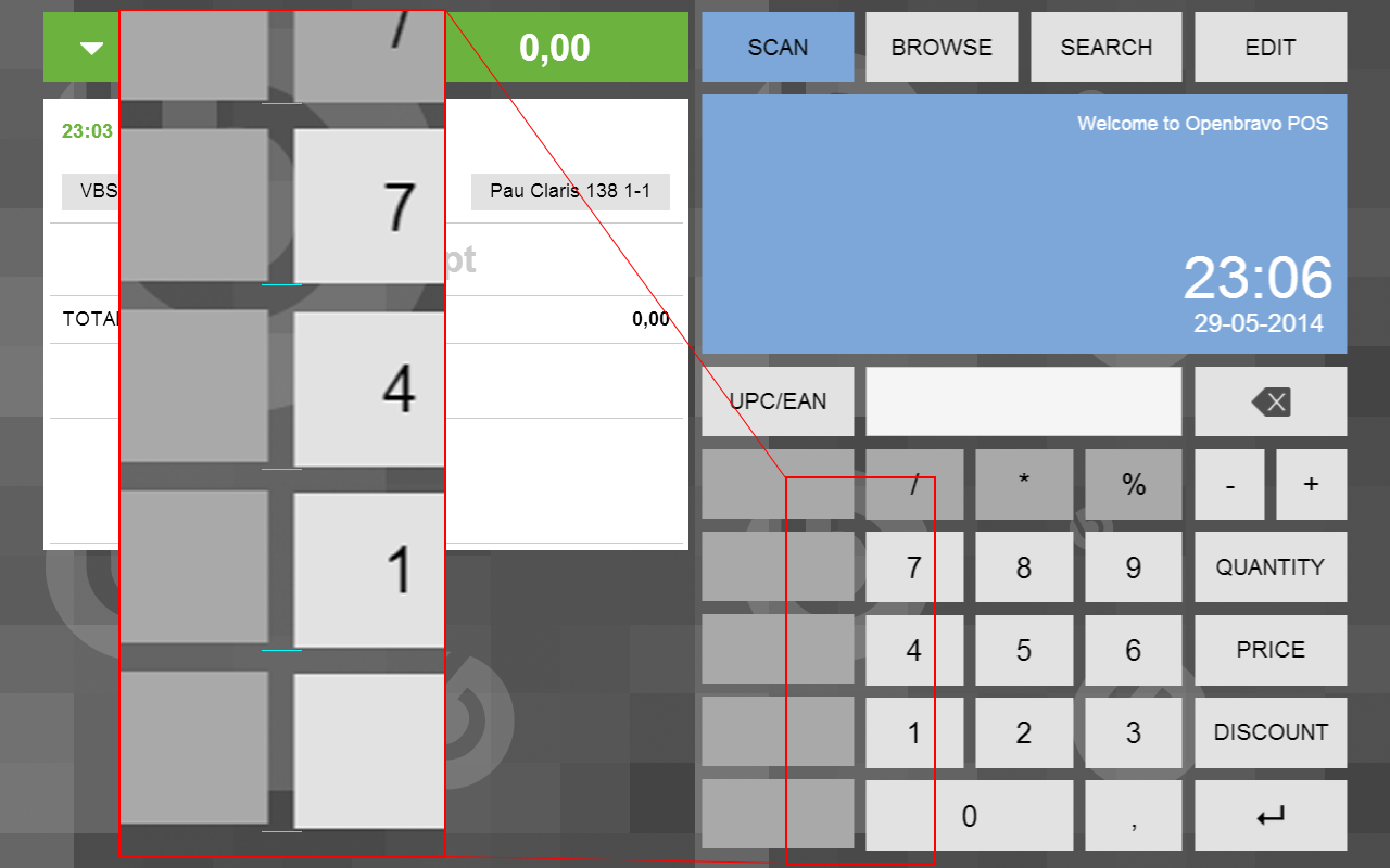
Case 2: Inside the keypad, the payment method buttons height it is not the same than the number buttons. The payment method buttons should be 1px taller.
You can see the attached [issueBoxAlignment-2.png] image and notice that due to this height difference, there is an increasing misalignment between the payment buttons and the number buttons
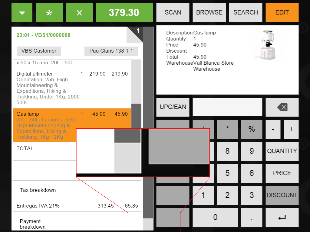
Case 3: Each different tab content has a different height. This is wrong. You can see the attached [issueBoxAlignment-3.png] image, that the only ones that have proper height are SCAN, BROWSE and EDIT.
The index card, the ticket and the SEARCH tab have wrong height. In the case of the ticket and the SEARCH tab what is wrong is the maximum height that should have once the scroll appears; while they have no data, they should remain as they are now.
IMPORTANT: This case 3 should be fixed AFTER the previous cases in order to set the proper height in the wrong cases when the upper side be already adjusted |
| Steps To Reproduce | Login into the WebPOS |
| Proposed Solution | |
| Additional Information | |
| Tags | No tags attached. |
| Relationships | | related to | defect | 0030910 | | closed | dbaz | [UX] Problems with alignments due to Chrome 45 |
|
| Attached Files |  issueBoxAlignment-1.png (147,368) 2014-05-29 23:39 issueBoxAlignment-1.png (147,368) 2014-05-29 23:39
https://issues.openbravo.com/file_download.php?file_id=6968&type=bug

 issueBoxAlignment-2.png (117,000) 2014-05-29 23:40 issueBoxAlignment-2.png (117,000) 2014-05-29 23:40
https://issues.openbravo.com/file_download.php?file_id=6969&type=bug

 issueBoxAlignment-3.png (377,408) 2014-06-03 21:18 issueBoxAlignment-3.png (377,408) 2014-06-03 21:18
https://issues.openbravo.com/file_download.php?file_id=6979&type=bug
 issueBoxAlignment-4.png (118,254) 2015-03-20 14:57 issueBoxAlignment-4.png (118,254) 2015-03-20 14:57
https://issues.openbravo.com/file_download.php?file_id=7916&type=bug

|
|
| Issue History |
| Date Modified | Username | Field | Change |
| 2014-05-29 23:39 | dbaz | New Issue | |
| 2014-05-29 23:39 | dbaz | Assigned To | => malsasua |
| 2014-05-29 23:39 | dbaz | OBNetwork customer | => No |
| 2014-05-29 23:39 | dbaz | Triggers an Emergency Pack | => No |
| 2014-05-29 23:39 | dbaz | File Added: issueBoxAlignment-1.png | |
| 2014-05-29 23:40 | dbaz | File Added: issueBoxAlignment-2.png | |
| 2014-05-29 23:40 | dbaz | Summary | Misalignment between several WebPOS boxes => [UX] Misalignment between several WebPOS boxes |
| 2014-06-03 21:18 | dbaz | File Added: issueBoxAlignment-3.png | |
| 2014-06-03 22:07 | dbaz | Description Updated | bug_revision_view_page.php?rev_id=5910#r5910 |
| 2014-06-03 22:11 | dbaz | Description Updated | bug_revision_view_page.php?rev_id=5911#r5911 |
| 2015-03-20 14:57 | dbaz | File Added: issueBoxAlignment-4.png | |
| 2015-09-23 19:16 | dbaz | Relationship added | related to 0030910 |
| 2017-01-05 11:58 | dbaz | Assigned To | malsasua => Retail |
| 2017-01-05 11:58 | dbaz | Note Added: 0093220 | |
| 2017-03-28 18:11 | rqueralta | Assigned To | Retail => rqueralta |
| 2017-03-28 18:11 | rqueralta | Status | new => scheduled |