Openbravo Issue Tracking System - Openbravo ERP |
| View Issue Details |
|
| ID | Project | Category | View Status | Date Submitted | Last Update |
| 0020406 | Openbravo ERP | A. Platform | public | 2012-05-03 13:22 | 2013-04-25 08:50 |
|
| Reporter | rgoris | |
| Assigned To | AugustoMauch | |
| Priority | high | Severity | major | Reproducibility | always |
| Status | new | Resolution | open | |
| Platform | | OS | 5 | OS Version | |
| Product Version | | |
| Target Version | | Fixed in Version | | |
| Merge Request Status | |
| Review Assigned To | |
| OBNetwork customer | No |
| Web browser | |
| Modules | Core |
| Support ticket | |
| Regression level | |
| Regression date | |
| Regression introduced in release | |
| Regression introduced by commit | |
| Triggers an Emergency Pack | No |
|
| Summary | 0020406: Styling issues in Modify Payment plan window |
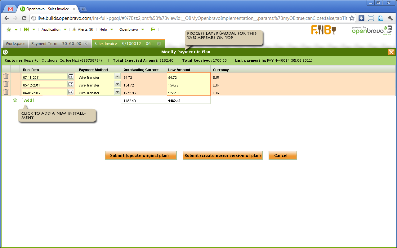
| Description | As per Paolo Juvara´s feedback: "If you press the button, you are taken to a gigantic white screen with just a record on top (that does not even occupy the entire row), and the button at the bottom. This screen is really, really, ugly and looks very unprofessional. A typical payment plan has just one entry and at most 3 or 4. Why the whole screen?" |
| Steps To Reproduce | On a large screen monitor, launch the Modify Payment window. |
| Proposed Solution | The implemented design of this window deviates a lot from what was initially designed. See attached images.
To make this window look good again we need to work on:
- stretching the row to fill the entire width
- removing unused white space
- moving buttons up
- placing Add New closer to the grid
- possibly adding a readonly status area (green) above the grid
- more, consult RGO when starting this fix |
| Additional Information | |
| Tags | No tags attached. |
| Relationships | | related to | defect | 0019352 | | closed | dbaz | "Pick & Execute" bottom buttons should be in the bottom |
|
| Attached Files |  EDIT_PAYPLAN_0001_P-E.png (70,495) 2012-05-03 13:22 EDIT_PAYPLAN_0001_P-E.png (70,495) 2012-05-03 13:22
https://issues.openbravo.com/file_download.php?file_id=5188&type=bug
|
|
| Issue History |
| Date Modified | Username | Field | Change |
| 2012-05-03 13:22 | rgoris | New Issue | |
| 2012-05-03 13:22 | rgoris | Assigned To | => alostale |
| 2012-05-03 13:22 | rgoris | File Added: EDIT_PAYPLAN_0001_P-E.png | |
| 2012-05-03 13:22 | rgoris | Modules | => Core |
| 2012-05-03 13:22 | rgoris | OBNetwork customer | => No |
| 2012-05-03 13:24 | rgoris | Relationship added | related to 0019352 |
| 2012-09-10 10:26 | AugustoMauch | Assigned To | alostale => mirurita |
| 2012-09-10 14:06 | dmiguelez | Assigned To | mirurita => AugustoMauch |
| 2013-04-25 08:50 | alostale | Triggers an Emergency Pack | => No |
| 2013-04-25 08:50 | alostale | Note Added: 0058219 | |
| 2013-04-25 08:50 | alostale | Type | defect => design defect |