Openbravo Issue Tracking System - Openbravo ERP |
| View Issue Details |
|
| ID | Project | Category | View Status | Date Submitted | Last Update |
| 0017105 | Openbravo ERP | A. Platform | public | 2011-05-10 18:50 | 2011-07-19 09:09 |
|
| Reporter | psanjuan | |
| Assigned To | alostale | |
| Priority | high | Severity | major | Reproducibility | always |
| Status | closed | Resolution | out of date | |
| Platform | | OS | 20 | OS Version | Ubuntu 8.04.1 |
| Product Version | | |
| Target Version | 3.0MP2 | Fixed in Version | | |
| Merge Request Status | |
| Review Assigned To | |
| OBNetwork customer | No |
| Web browser | |
| Modules | Core |
| Support ticket | |
| Regression level | |
| Regression date | |
| Regression introduced in release | |
| Regression introduced by commit | |
| Triggers an Emergency Pack | No |
|
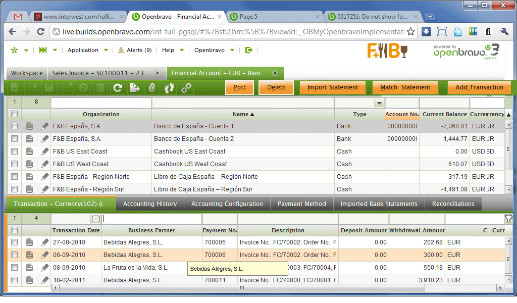
| Summary | 0017105: it is not use friendly to have all the buttons (header & lines) at the same level |
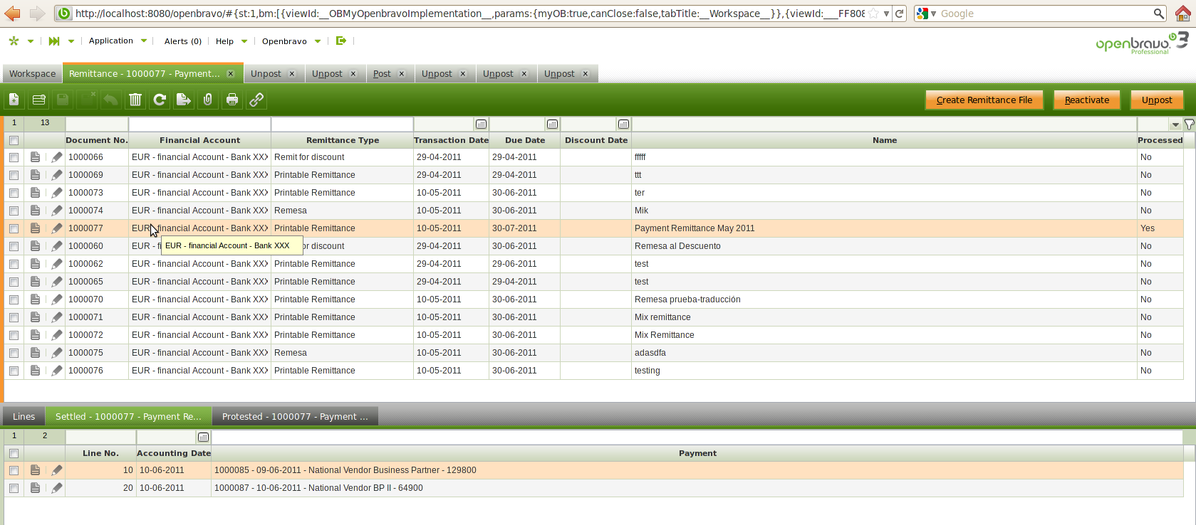
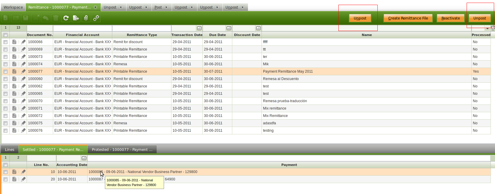
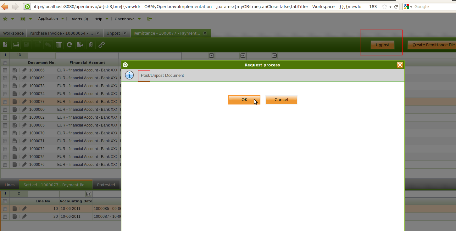
| Description | it is not use friendly to have all the buttons (header & lines) at the same level, an example can be found in the remittance window. See screen attached.
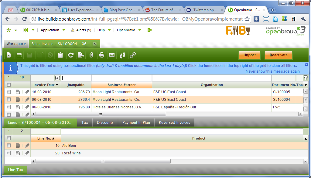
Even more in the lines there is one posted and one do not posted but "Unpost" button is shown for both of them.
No matter what the status of each lines is, "Unpost" button is always shown. |
| Steps To Reproduce | |
| Proposed Solution | Header buttons should be located in the header and Line buttons should be located in the lines. |
| Additional Information | |
| Tags | No tags attached. |
| Relationships | | related to | feature request | 0017044 | 3.0RC7 | closed | alostale | Add to child tabs buttons defined within its parent | | related to | defect | 0017326 | 3.0MP2 | closed | alostale | OPTIMIZE-17: Button Level Awareness via visual hints | | related to | defect | 0017327 | 3.0MP0 | closed | eduardo_Argal | OPTIMIZE-18: Shorten process button labels and add tooltip | | related to | feature request | 0017328 | | new | Triage Platform Base | [Processes & Pickers] Combination Process Buttons + Lose Process Windows | | blocks | defect | 0017334 | 3.0MP0 | closed | vmromanos | Do not show Lines buttons together with the Header one in Reconciliation tab of Financial Account and Lines in the Remittance |
|
| Attached Files |  foco_header.png (145,605) 2011-05-10 18:55 foco_header.png (145,605) 2011-05-10 18:55
https://issues.openbravo.com/file_download.php?file_id=3967&type=bug
 foco_lines.png (124,101) 2011-05-10 18:55 foco_lines.png (124,101) 2011-05-10 18:55
https://issues.openbravo.com/file_download.php?file_id=3968&type=bug
 lines.png (107,864) 2011-05-10 18:58 lines.png (107,864) 2011-05-10 18:58
https://issues.openbravo.com/file_download.php?file_id=3969&type=bug
 processes.csv (8,615) 2011-05-16 17:29 processes.csv (8,615) 2011-05-16 17:29
https://issues.openbravo.com/file_download.php?file_id=4009&type=bug
 contextColoringButtons.png (59,420) 2011-05-20 17:46 contextColoringButtons.png (59,420) 2011-05-20 17:46
https://issues.openbravo.com/file_download.php?file_id=4066&type=bug
 NetBooksResolution.png (124,366) 2011-05-20 17:53 NetBooksResolution.png (124,366) 2011-05-20 17:53
https://issues.openbravo.com/file_download.php?file_id=4067&type=bug
 GettingTight.png (112,682) 2011-05-20 17:54 GettingTight.png (112,682) 2011-05-20 17:54
https://issues.openbravo.com/file_download.php?file_id=4068&type=bug
 LAW.zip (375,282) 2011-05-23 14:42 LAW.zip (375,282) 2011-05-23 14:42
https://issues.openbravo.com/file_download.php?file_id=4073&type=bug
 LAW_0006_Parent-Outline.png (52,941) 2011-05-24 01:07 LAW_0006_Parent-Outline.png (52,941) 2011-05-24 01:07
https://issues.openbravo.com/file_download.php?file_id=4079&type=bug
 LAW_0007_Child-Outline.png (53,567) 2011-05-24 01:07 LAW_0007_Child-Outline.png (53,567) 2011-05-24 01:07
https://issues.openbravo.com/file_download.php?file_id=4080&type=bug
 LAW_0008_Mix-Outline.png (69,745) 2011-05-24 01:08 LAW_0008_Mix-Outline.png (69,745) 2011-05-24 01:08
https://issues.openbravo.com/file_download.php?file_id=4081&type=bug
|
|
| Issue History |
| Date Modified | Username | Field | Change |
| 2011-05-10 18:50 | psanjuan | New Issue | |
| 2011-05-10 18:50 | psanjuan | Assigned To | => alostale |
| 2011-05-10 18:50 | psanjuan | Modules | => Core |
| 2011-05-10 18:50 | psanjuan | OBNetwork customer | => No |
| 2011-05-10 18:53 | psanjuan | Description Updated | bug_revision_view_page.php?rev_id=1957#r1957 |
| 2011-05-10 18:55 | psanjuan | File Added: foco_header.png | |
| 2011-05-10 18:55 | psanjuan | File Added: foco_lines.png | |
| 2011-05-10 18:58 | psanjuan | File Added: lines.png | |
| 2011-05-16 09:50 | alostale | Assigned To | alostale => rgoris |
| 2011-05-16 17:29 | rgoris | File Added: processes.csv | |
| 2011-05-16 17:36 | rgoris | Note Added: 0037036 | |
| 2011-05-16 17:39 | rgoris | Relationship added | related to 0017044 |
| 2011-05-16 17:41 | rgoris | Note Added: 0037037 | |
| 2011-05-16 17:41 | rgoris | Assigned To | rgoris => alostale |
| 2011-05-16 17:41 | rgoris | Status | new => scheduled |
| 2011-05-16 17:41 | rgoris | Target Version | => 3.0MP0 |
| 2011-05-16 17:45 | alostale | Assigned To | alostale => psanjuan |
| 2011-05-16 18:31 | psanjuan | Proposed Solution updated | |
| 2011-05-16 18:51 | rgoris | Note Added: 0037039 | |
| 2011-05-16 18:57 | rgoris | Note Edited: 0037039 | bug_revision_view_page.php?bugnote_id=0037039#r2003 |
| 2011-05-20 15:57 | psanjuan | Note Added: 0037284 | |
| 2011-05-20 17:46 | rgoris | File Added: contextColoringButtons.png | |
| 2011-05-20 17:46 | rgoris | Note Added: 0037290 | |
| 2011-05-20 17:53 | rgoris | File Added: NetBooksResolution.png | |
| 2011-05-20 17:54 | rgoris | File Added: GettingTight.png | |
| 2011-05-20 17:54 | rgoris | Note Edited: 0037290 | bug_revision_view_page.php?bugnote_id=0037290#r2080 |
| 2011-05-23 12:38 | psanjuan | Note Added: 0037311 | |
| 2011-05-23 14:42 | rgoris | Note Added: 0037330 | |
| 2011-05-23 14:42 | rgoris | File Added: LAW.zip | |
| 2011-05-23 19:27 | dmitry_mezentsev | Assigned To | psanjuan => alostale |
| 2011-05-24 00:23 | rgoris | Issue Monitored: rgoris | |
| 2011-05-24 00:24 | rgoris | Note Edited: 0037330 | bug_revision_view_page.php?bugnote_id=0037330#r2090 |
| 2011-05-24 01:07 | rgoris | File Added: LAW_0006_Parent-Outline.png | |
| 2011-05-24 01:07 | rgoris | File Added: LAW_0007_Child-Outline.png | |
| 2011-05-24 01:08 | rgoris | File Added: LAW_0008_Mix-Outline.png | |
| 2011-05-24 01:09 | rgoris | Note Added: 0037360 | |
| 2011-05-24 10:18 | alostale | Note Added: 0037364 | |
| 2011-05-24 10:18 | alostale | Priority | urgent => high |
| 2011-05-24 10:34 | rgoris | Relationship added | related to 0017326 |
| 2011-05-24 10:55 | rgoris | Relationship added | related to 0017327 |
| 2011-05-24 10:56 | rgoris | Relationship added | related to 0017328 |
| 2011-05-24 13:37 | dmitry_mezentsev | Relationship added | blocks 0017334 |
| 2011-06-02 10:54 | dmitry_mezentsev | Target Version | 3.0MP0 => 3.0MP1 |
| 2011-06-22 19:26 | dmitry_mezentsev | Target Version | 3.0MP1 => 3.0MP2 |
| 2011-07-19 09:09 | alostale | Note Added: 0039202 | |
| 2011-07-19 09:09 | alostale | Status | scheduled => closed |
| 2011-07-19 09:09 | alostale | Resolution | open => out of date |
|
Notes |
|
|
(0037036)
|
|
rgoris
|
|
2011-05-16 17:36
|
|
This issue is a direct consequence of the decision we took earlier to allow displaying header-related process buttons when in lines.
We did this to make document completion faster, e.g. when entering a sales order you must be able to complete the order when the focus is in lines (this is where you are when you want to complete the order).
As line-specific processes are very rare and mostly sit in less common windows (see .csv file attached) few problems like this are expected.
This said, in your case, ambiguity is caused by identical labeling. My first advice is to reconsider if you really need to (un)process on individual line level, perhaps redesign the process, but if you really have to, then it is best to rename the buttons to make them more specific:
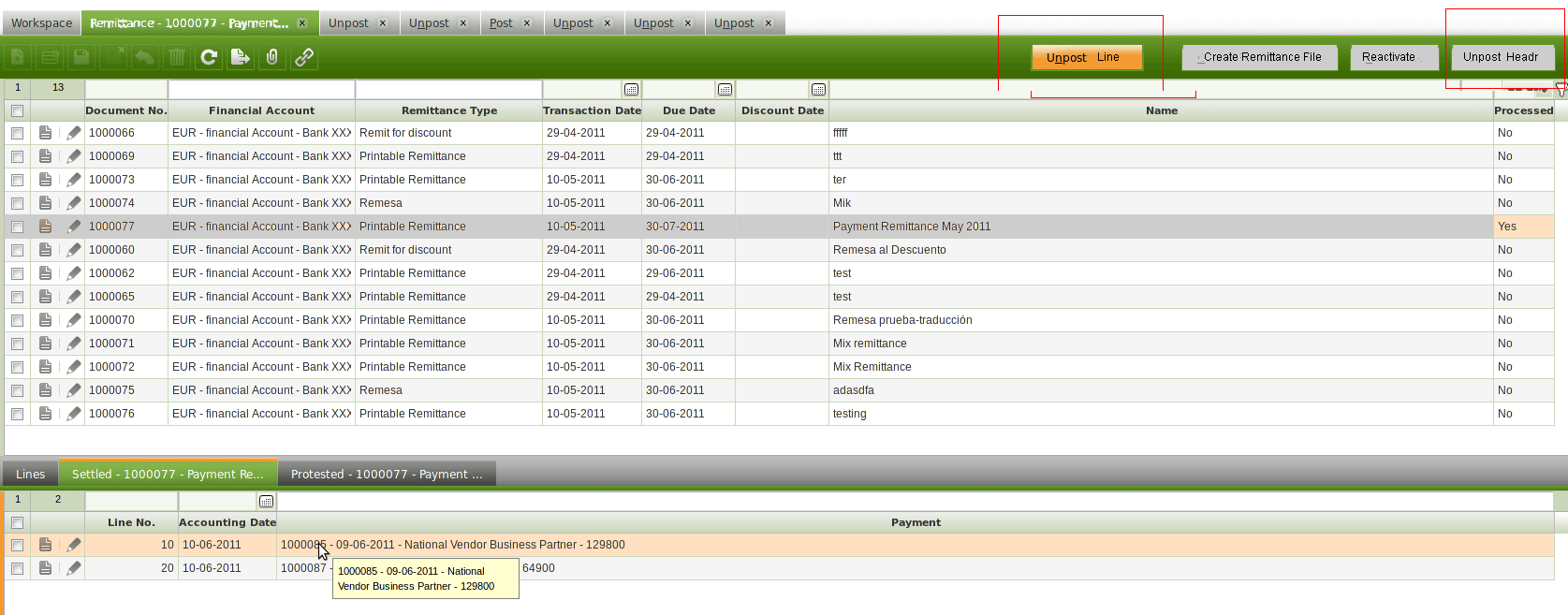
Unpost Header
Unpost Line |
|
|
|
(0037037)
|
|
rgoris
|
|
2011-05-16 17:41
|
|
|
Second thing to solve is to split the Posted and Unposted processes where buttons and process pops are named accordingly. |
|
|
|
(0037039)
|
|
rgoris
|
2011-05-16 18:51
(edited on: 2011-05-16 18:57) |
|
Rethought:
There is no problem i believe.
Here is the logic:
You need to post the header first before you can post lines.
-> Following this logic you can never have two post buttons at a time
You need to unpost all lines first to be able to unpost the header??
-> Following this logic you can never have two unpost buttons at a time
|
|
|
|
|
We can not be 100% sure of that every header-lines posting options will required first to post/unpost the header and second post/unpost the lines.
There could not be just Post buttons but Process or other kind of buttons both at header and lines level.
We need to find the right design solution which in my opinion it is not just to have 1 button for both header and lines.
Header should have its own buttons, visible and working when the focus is on the header.
Lines should have its own process buttons, visible and working when the focus is on the lines. |
|
|
|
(0037290)
|
|
rgoris
|
2011-05-20 17:46
(edited on: 2011-05-20 17:54) |
|
Openbravo 3 master detail interaction design uses one fixed toolbar that contains both action buttons and process buttons. The actions and processes that are executed when pressing these buttons are applied to the selected object (a selected row or an open form) in an active level (parent or child or grandchild, etc.).
The reason why the one fixed toolbar was chosen and not a dynamic toolbar (that appears in an active level when this level is activated) or two fixed toolbars (one for each level) is five-fold:
1) Optimal use of precious vertical real estate. In OB3 we introduced a two-level view which doubles the amount of data visible at once. We have optimized the page design as such that a two level view makes sense down to resolutions of 1024x600xpx (typical Netbook resolution) to avoid scrolling and to make a master-detail view worthwhile. See image below how Openbravo 3 looks like on aforementioned Netbook resolution. I do not see how to fit in another toolbar in the child level.
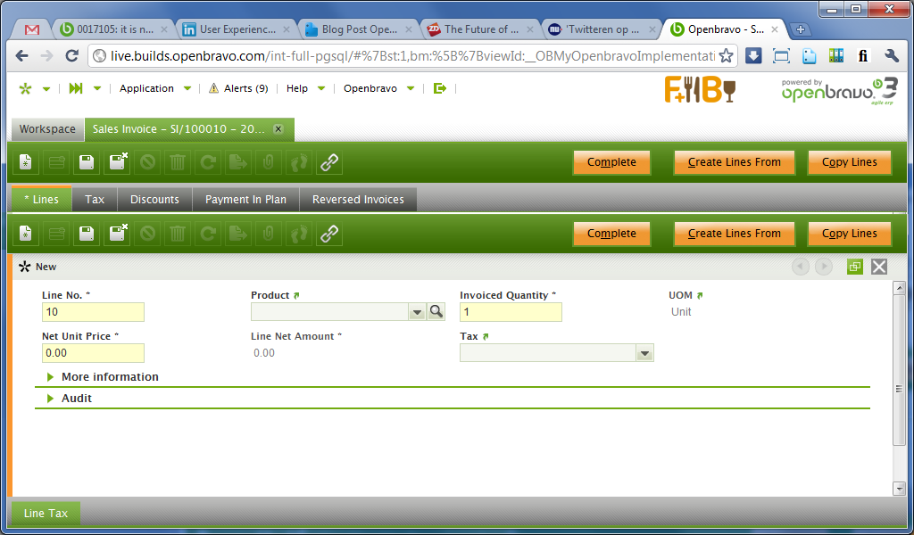
2) Redundancy. Having a toolbar for each individual level will mean that most action buttons will be repeated. This might look acceptable in a 50-50% screen level partition but in other cases, this look clumsy, if not unprofessional and - even worse - confusing for the user. See second image below.
3) Movement of objects (aka as "moving target"). Having dynamic individual toolbars for each levels means that they only appear when a row is selected. This means that once you do so, the toolbar is inserted between the tab bar and the grid and will suddenly push the grid down, hereby causing a motion "jerk". This can cause the user to lose his focus, or even worse, this can cause the selected row to move outside the active area. Selected objects should not move.
4) Infrequency of occasions does not justify sacrificing overall usability. Although I understand and empathize with the problem you have in your screen design, I see this as an exception. The majority of the Openbravo windows only have processes applied to their headers. The windows that do have process applied to their children, are mostly the more obscure windows, badly designed windows/processes or configuration windows. Openbravo 3 was designed for high productivity of the majority of the use cases and lesser so for exceptional cases. FYI attached in the issue, an Excel file shows the windows that have processes in child level or deeper.
5) Reduced cognitive load. Having a dedicated toolbar for each level would mean that typical header processes (such as Copy Lines) will only appear in the header. Although logical from a system POV, for the user this would not make sense when in lines. A process such as Copy Lines would be expected in the lines. Having two toolbars means that you force the user in decision making on where to look. Having the process buttons in one place, regardless of the active level, reduces the cognitive load: the user always know where to look.
But this theory and we need a solution for your windows. As per my comment in the issue, i do not believe we can two Post or two Unpost processes for header and lines at a time. But even if it were possible, then this case is unique (having the same process for both header and lines) and I am strongly against the possibility. Within an ERP system, if a process such as Complete, Post and Process (the last one is way too unspecific, but this is a side note) is applied to a parent object, this implies that all children objects will also be completed, posted, processed, etc. It goes against all logic when a user is able to complete, post, process, etc a parent and then see children with status unposted. If the business process forces you to have the same process for header and lines, then it should be made very clear which level is affected by pressing a button. It should also be clear what is the status of each level (read only fields).
So my recommended solutions (in order of preference) is to :
(1) reconsider the design of the window or even the business flow
(2) apply logic (if not in place already) that:
* You need to post the header first before you can post lines -> Following this logic you can never have two post buttons at a time
* You need to unpost all lines first to be able to unpost the header?? -> Following this logic you can never have two unpost buttons at a time
(3) label the buttons appropriately: Post Line, Post Header, Unpost Line, Unpost Header
(4) additionally (but not instead) we could add processes to the context menu (right mouse click)
(5) contextual button coloring: this will not happen in GA but this idea might mitigate some of your pain. The idea is that, once we have https://issues.openbravo.com/view.php?id=16569 [^] in place (this is planned for GA) this means that a non-active level selected row will be gray. The same color coding can be used for the buttons that relate to that level. See image contextColoringButtons.png
|
|
|
|
|
|
A solution must be given for MP0 |
|
|
|
(0037330)
|
|
rgoris
|
2011-05-23 14:42
(edited on: 2011-05-24 00:24) |
|
Here is my proposed solution. it also aims to solve an other issue (messages appear in the wrong level)
1. We stick with the current implementation of showing both parent and child process buttons when in child level
2. A non-active grid cannot have orange selected row(s). Instead, they turn into gray. This is the "Level Awareness" fix we have scheduled. ( https://issues.openbravo.com/view.php?id=16569 [^] )
3. Process button labels must be shortened where necessary. This is especially the case for Financial Accounts. In the attached images you can find shorter versions.
4. In case two identical processes exist for both parent and child, then labeling must be specific (e.g. Post Line)
5. Process buttons use adaptive coloring: if they pertain to an active level, they are orange. If they belong to a non-active level, they are still visible, but now in gray. (as a side note, i believe that this also indirectly helps to enhance the user´s level-awareness)
6. Completion/error/all messages appear in the level they apply to. E.g. if a user completes a sales order while in child level, the completion success message must appear in the header level. In case the other level is collapsed, the system will force it to expand in order to be able to show the message. Psarobe has created an issue for this.
7. Tooltips must be added to process buttons explaining the process into more detail, together with the level the process is applied to
Find attached a sequence of annotated images that depicts all of the above.
|
|
|
|
(0037360)
|
|
rgoris
|
|
2011-05-24 01:09
|
|
I think is the best solution so far: It uses the button outline to communicate its dependency on the active level. It is much more subtle than the gray-orange differences but enough to get noticed.
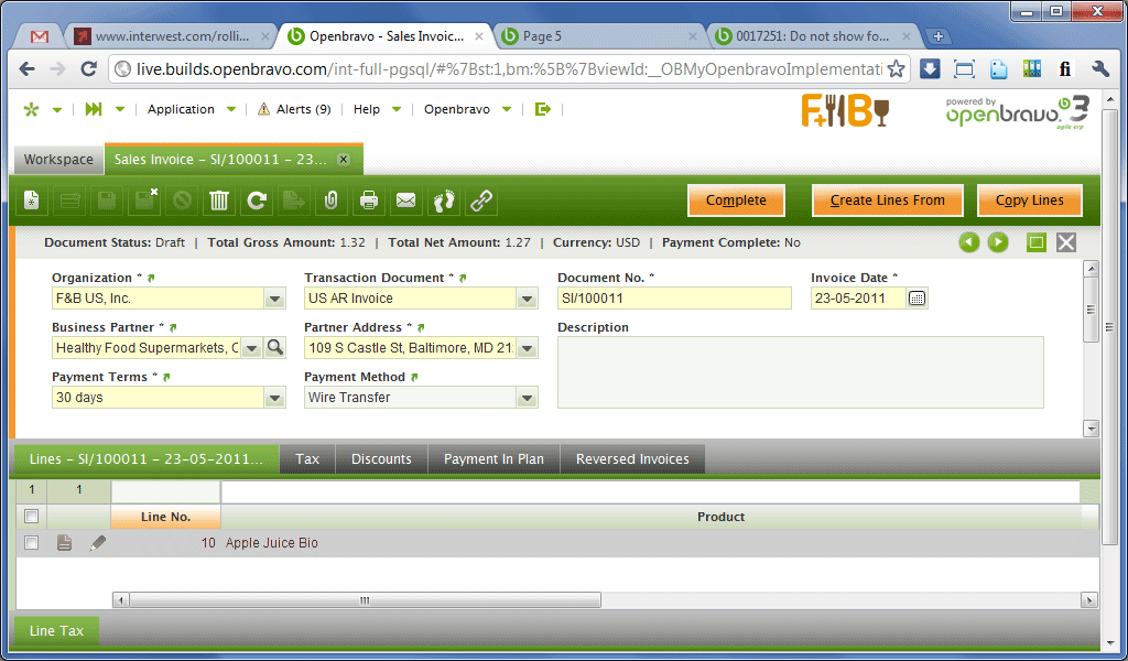
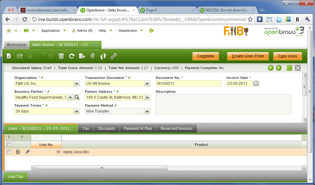
(IMG LAW 0006) Header level is active: header process buttons show a bright white outline
(IMG LAW 0007) Lines level is active: header process buttons show a regular outline.
(IMG LAW 0008) Financial account lines active: notice the different button outlines (Post and Delete are related to the lines) |
|
|
|
|
|
As per discussion, current solution is to add a check in Tab not to show parent's buttons (defaulted to be shown). The rest of the solution will be implemented within next releases. |
|
|
|
|
|